My talk begins at 0:36.
The app is hosted here, the code is here, and a blog post discussing the project in further detail is here.
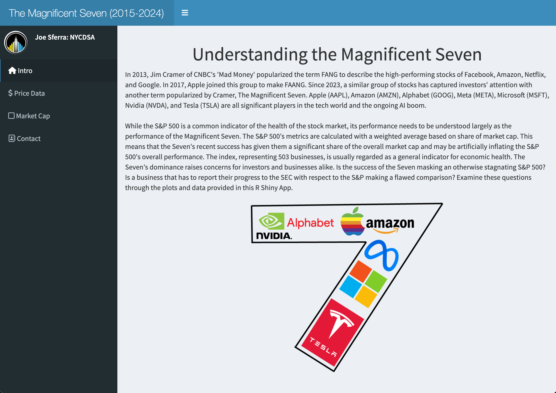
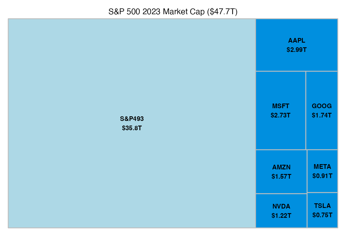
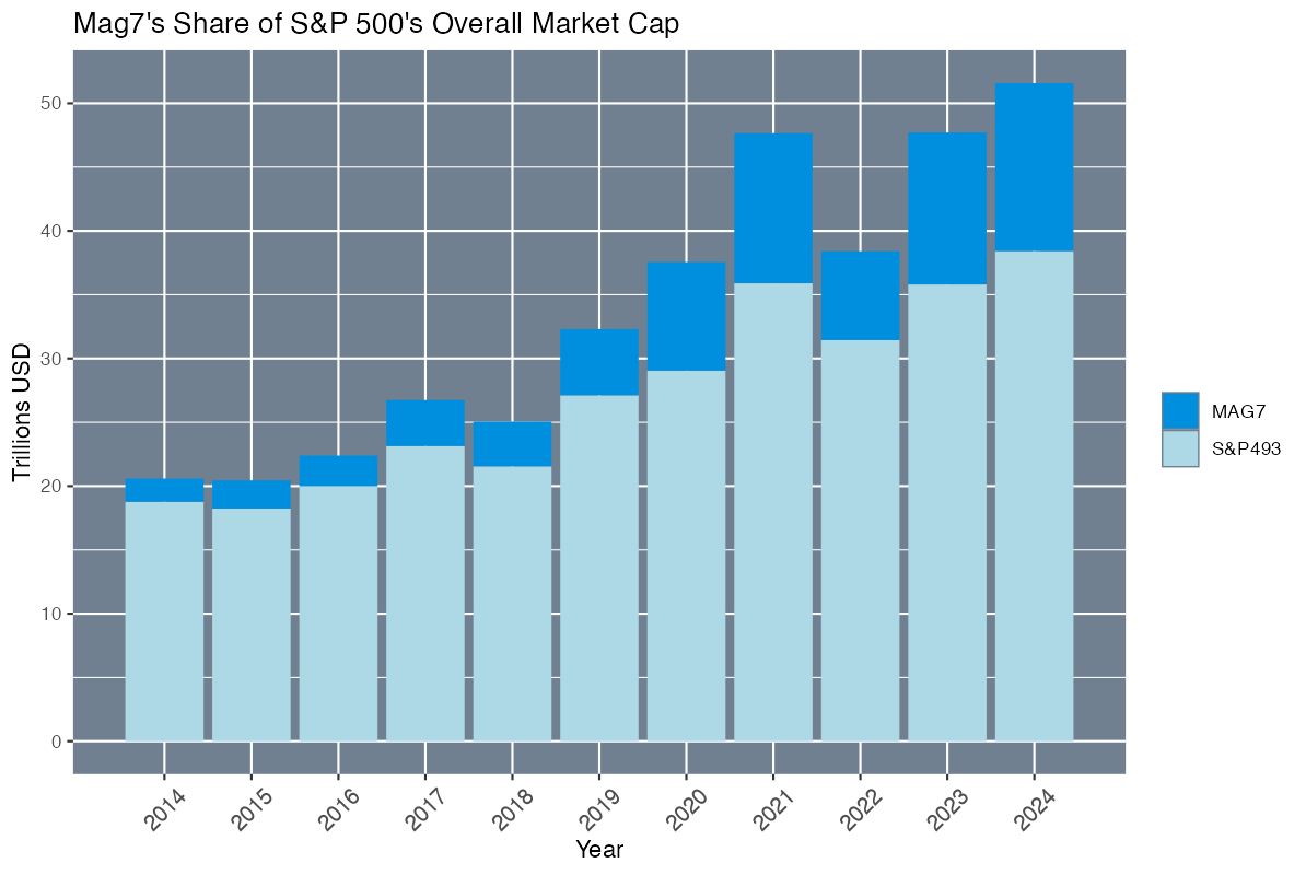
Interactive dashboard in R/Shiny examining the “Magnificent Seven” stocks while comparing their performance to the S&P 500. While avoiding giving investing advice, I illustrate the Seven’s outsize share of the S&P’s total market cap, suggesting that these companies’ performances (boosted by Covid-19 and the craze for AI) are inflating the S&P’s overall performance.
In the app, you can customize several visualizations of the Mag7 stocks and their performance compared to the S&P.


